Friday, 12 December 2014
Final Evaluations
Research
I found research for this project to actually be incredibly difficult.
It began easy enough, watching films, taking note of styles and defining elements, and looking at the promotional material, most of which I could name off the top of my head anyway; but writing the research was so tough when I had to apply critical thinking to something I had very little in depth knowledge of. It felt like my writing was very inconsistent, and incoherent, definitely not as good as I usually make it. I did get chance to try improve it and edit but still, over all I would say I was not happy with it.
The rest of my research was effective enough, purely for the fact that I had gotten so used to hearing and learning about advertisements, and reviews that writing about it came naturally to me.
If I could do it over again, I would look into, more romantic comedies, as I feel if I had watched a broader range of films I would have been able to apply theoretical knowledge to it more effectively. Otherwise, I am content with the other research I conducted, such as the reviews (even though I wanted to do a couple more of them), the trailers, and the promotional material and posters; it did give me some good ideas for my film though so I am thankful for that.
Planning
Coming up with the idea for my film was an easy part for me, as soon as I heard the brief I had a couple of ideas swimming about so expanding on them was relatively simple, as written in my idea process post. After deciding to go with the idea for a trans couple who meet online, I wrote up the script, and planned the shoot.
Writing the script was one the most enjoyable things I have done in the project, planning each scene and how I wanted it to look was much easier to visualize and produce than if I had tried to storyboard or shoot it right off the bat. One thing that made writing the script easy was that throughout my research and watching pre existing rom coms, the idea kept developing and changing in my head, with certain scenes and elements becoming more cemented, and more desirable to achieve; having a firm idea of what I wanted in the film meant I was able to complete the script fairly quickly, and the fact that the idea rarely strayed from its original vision also helped me write it in plenty of detail, with each scene featuring exactly what I wanted in it.
After the script was complete I contacted the actresses I wanted to use, sent them the script, and set up a date for shooting. With the actresses and places organised, I created the plan for the shoot; this featured the costumes, the props, the equipment, and the precise schedule for shooting by the hour. I stuck to this script fairly strictly, apart from after day one (which was originally was meant to encompass all the scenes to be shot) I had lost the location for Rileys apartment, so I had to contact Huddersfield Uni students to ask permission to use their flats for shooting, I reached one of my actresses friends Shanade, who generously provided her uni flat to be Rileys.
Finally there was a simple matter of deciding on transport and meeting details, and we were ready for the shoot.
Overall, planning was easy and rather enjoyable. The obsessive compulsive in me enjoyed planning each detail of which scenes were to be shot when, how, and where; and I think the planning was very solid and left a good base to ensure maximum effectiveness when shooting my film.
Shooting
Shooting way by far the best, and most successful, experience I had during this project.
This is put down partly to the planning I did as I took time to plan it out entirely, as putting everything down, and ordering it just helped keep me on track to finish the shooting quickly and efficiently. It was also helped in most part to the actresses as well, because they would give me suggestions as we shot and helped with problems and were generally incredibly helpful.
On the first day of shooting we shot all of Isabella's scenes at Sophias uni flat. The shoot at the flat went incredibly smooth, we had no technical issues (as I have worked with the camera before) and Sophia worked quickly and intelligently, and understood everything I wanted her to do and suggested cute little gestures to help add to her character. She also came up with the idea to type a genuine conversation between herself and another version of her to her friend Alexia so I could get genuine footage of her typing, and her genuine laughter and responses so I could get each shot regardless of what it shown, with her real true emotions. This helped my film as it made it more immersive as viewers always reflect the genuine emotions they see. Sop was also a star as when the initial locations for Rileys shots were made unavailable as she was the one who contacted her other friends to get me a new location.
The second day (which was actually 4 days after the first), also went smoothly. The only issue we had was that my tripod had the base for the camera missing so I couldn't use it, meaning all shots had to be done by hand which did result in shakier footage sadly. This was also the shoot where I was able to let the true friendship between the two actresses come out and interact properly together when their characters had joint scenes. They both played about and all I had to do was make sure I got the shot and just let them do what they wanted; I do think it did work better having a real couple play the couple on screen because in scenes where they had to act romantic, or in love, they do it realistically and with so much genuine feeling it just makes the shot that much better. I did have a little trouble though with the solo shots of Jess because shes a little anxious in front of the camera, it was a bit difficult at times but that was only with a couple shots so a majority of my shots were as I wanted.
The other technical form of shooting I did was recording my screen for the chat and internet sections. Using a program called CamStudio, which records your computer screen as if the desktop is the camera allowing for much more flexible footage without the issues of using a camera, such as glare, lack of focus, and inconsistent colours. Using this recorder, I chatted to an account on facebook to simulate the conversations between the characters (even though I couldn't respond as another person so its difficult to tell who sends what), and when I was browsing tumblr as filler pieces to bulk out the montages and give it some better context.
Overall, the shoot went really well for my first major shoot, there was a couple lines or shots removed, and a couple added in but I like what I got overall and think the final cut does have the potential to be what I wanted.
Editing
Now editing has been a weird trip this time around. Obviously, editing each video is a different experience so nothing will be expected, but I ran into way more issues than I'm used to.
This is due to the fact that I had a portable version of Sony Vegas and the full version, the difference being that the portable is a lighter file and can run off a memory stick, but the lighter file means it is missing elements that help it run quicker and smoother, making it a fairly buggy and temperamental program; so moving the file between portable and full did induce errors such as: inability to open video files, inability to edit, missing files, and occasional sound bugs where it would jump or break, increasing the time it took to edit my final piece.
To begin though, I imported every raw video file into Sony Vegas Pro 11, along with the screen captured footage from my computer and 2 episodes of the TV Show 'Supernatural', which my characters have in common, thus bringing them together.
After importing them, I chose the music I wanted to play alongside my trailer, I went for the song that was in my head throughout the entire idea process which was: Hopeless Wanderer by Mumford and Sons. I like this song a lot, its the cute pop style that fits well into the genre of rom com, but its got deeper meanings of being lost, and lonely which I think worked well with the themes of my story especially when they split up.
When every file was imported, I took out the script and began editing exactly as I had planned on paper. This was a good idea for me because as soon as I rendered the first intro, and watched it, it made me want to change it immediately. I still ran alongside the script but it was more fluid as instead of rigorously following my plan, I allowed it to be a guideline because otherwise the film looked clunky and would be too long for a trailer so I stopped the original plan and instead allowed some of the later ideas to work their ways in.
This lead to the more successful second render of the intro where the sections with no music (that were nearly a minute together) were cut to 10 seconds and the bulk of the trailer began. I liked this idea more, it grabbed attention much more effectively than my written plan, it set the mood quicker and gave a sense of pace to the ad.
This lead me into my first montage piece. Choosing certain clips off the top of my head was incredibly tough so instead I looked through the shots I had taken specifically for the montage, and went through the Supernatural episodes, and screen capture footage in the clip editor window for best bits that would show their love for the show, as well as its humour too. But I didn't want the show to look like a part of my trailer, so I added a VFX filter to the episode, and screen capture footage; going through a pre made filter called 'tv look' I edited it down to make it more subtle and achieve the look like a computer screen had been filmed with a regular camera while still being able to see what was going on. This helped especially with the chat as when I zoomed in to the chat, I could also make the computer effect grid zoom in too to achieve effects that would have been very difficult with any other type of technology. Also, during certain parts where I wanted it to be inline with the music or another visual, I would use marker in Vegas, which are helpful little tools used to mark along the timeline which comes in very handy for music as you can set each beat to help you edit in time to music.
I will admit there were some devices I was quite proud of while making my trailer, some of them are as follows: I liked using clips of the show to act as parallels to my characters and their conversations as I feel it showed just how much they bonded over it, how big a part of their lives it was, and how it affected them. I especially liked the pair of shots where we see the supernatural couple share a smile, and then my characters share a smile, because I think it shows their bond properly and truthfully.
Another element I like creating was when the music would quieten down and you would hear the characters voices or the organic sound. I know its been used before in films but I think its a great way to connect the music to the scene and helps immerse the viewer in the same feelings.
Although there was one device I was incredibly proud of creating was the effect on the music which made it sound like it was being played out of headphones because I thought it illustrated how upset she was perfectly. Like the music was playing all the time in her head and it was something that brought her joy, now its only something she can fake and never really be involved with again, which is also accented when Isabella starts typing again and the music lifts back into life playing at full capacity once more. I did this by taign the clip into Audacity and using low pass and high pass filters to simulate that sound as if it was being played from headphones.
After that it was final shots and edits, and the title cards.
In its entirety my trailer ended up being 190 seconds long, 40 seconds longer than the brief. I did create a cut down version which measured in at 160 seconds, however portable Vegas (A software I now despise) wouldn't allow me to render the video over 25%, as such only the directors cut is available to view.
After it was rendered I uploaded it to youtube in it standard wmv. format, the format and medium I chose to host this video didn't affect the ideas or my working process at all as its the process I am most comfortable with and most used to.
Overall, even though it was the most difficult part, Im glad I got it done; although I do see lots of errors and lots of things I wanted to edit and remake, and all the technical issues will always leave me slightly bitter abot Vegas, it was a learning expierience I drastically needed and I loved being able to get back to my hobby in a professional circumstance.
The final part of my production was creating the promotional. material for my film.
The main idea we were given was a poster, and although I liked this idea, the second I came accross digital posters I thought the idea was way better than a regular poster.
The difference between them (as I mentioned in my research) is the digital posters move and are only posted online; this would really help my production as mine is posted online so traditional printed posters wouldnt do as much advertising. For example, if I posted this on tumblr it would have the potential to get passed around thousands of people, maximising the spread of my film over the potential fanbase.
To make it, all I did was import frames of the video driectly into photoshop through the import function, then add coloured layers and change the filters to improve how they looked, and then add anyother details such as feathered backgrounds for particular colours to show through, or extra shapes and pictures for effect. These were finished off with the title and my name underneath.
I think my posters would do well at showing my ideas and the concept of my film well as it clearly shows the 2 girls as a romantic couple, and one clearly as a trans girl. I wanted to make it clear these girls aren't just 'tomboys', and they aren't just centrered around being gay. They are a genuine couple. with troubles and obstacles that don't just come down to their sexuality in the end; although they start that way for the girl who sees herself as straight, she sees past it and I think that comes accross in my poster.
I like the posters I made, I do think they make an impact and I like that I combined multiple ideas from my mock ups to create the final ones, its without a doubt my favourite part of my trailer.
Sadly, on a nother note, I didnt get the chance to expierience group critiques due to illness, hence the reason the section was left out.
To conclude, this project was certainly my most challenging, I didn't get to create the work I fully enviosioned nor to the standard I would have liked, but it helped me climb an incredibly steep learning curve which I will be forever greatful for. I have found more of my faults and how to correct them, and how my strengths can play to them and help them grow. It truly was a mind bendlingly taxing course with extreme payoff.
I found research for this project to actually be incredibly difficult.
It began easy enough, watching films, taking note of styles and defining elements, and looking at the promotional material, most of which I could name off the top of my head anyway; but writing the research was so tough when I had to apply critical thinking to something I had very little in depth knowledge of. It felt like my writing was very inconsistent, and incoherent, definitely not as good as I usually make it. I did get chance to try improve it and edit but still, over all I would say I was not happy with it.
The rest of my research was effective enough, purely for the fact that I had gotten so used to hearing and learning about advertisements, and reviews that writing about it came naturally to me.
If I could do it over again, I would look into, more romantic comedies, as I feel if I had watched a broader range of films I would have been able to apply theoretical knowledge to it more effectively. Otherwise, I am content with the other research I conducted, such as the reviews (even though I wanted to do a couple more of them), the trailers, and the promotional material and posters; it did give me some good ideas for my film though so I am thankful for that.
Planning
Coming up with the idea for my film was an easy part for me, as soon as I heard the brief I had a couple of ideas swimming about so expanding on them was relatively simple, as written in my idea process post. After deciding to go with the idea for a trans couple who meet online, I wrote up the script, and planned the shoot.
Writing the script was one the most enjoyable things I have done in the project, planning each scene and how I wanted it to look was much easier to visualize and produce than if I had tried to storyboard or shoot it right off the bat. One thing that made writing the script easy was that throughout my research and watching pre existing rom coms, the idea kept developing and changing in my head, with certain scenes and elements becoming more cemented, and more desirable to achieve; having a firm idea of what I wanted in the film meant I was able to complete the script fairly quickly, and the fact that the idea rarely strayed from its original vision also helped me write it in plenty of detail, with each scene featuring exactly what I wanted in it.
After the script was complete I contacted the actresses I wanted to use, sent them the script, and set up a date for shooting. With the actresses and places organised, I created the plan for the shoot; this featured the costumes, the props, the equipment, and the precise schedule for shooting by the hour. I stuck to this script fairly strictly, apart from after day one (which was originally was meant to encompass all the scenes to be shot) I had lost the location for Rileys apartment, so I had to contact Huddersfield Uni students to ask permission to use their flats for shooting, I reached one of my actresses friends Shanade, who generously provided her uni flat to be Rileys.
Finally there was a simple matter of deciding on transport and meeting details, and we were ready for the shoot.
Overall, planning was easy and rather enjoyable. The obsessive compulsive in me enjoyed planning each detail of which scenes were to be shot when, how, and where; and I think the planning was very solid and left a good base to ensure maximum effectiveness when shooting my film.
Shooting
Shooting way by far the best, and most successful, experience I had during this project.
This is put down partly to the planning I did as I took time to plan it out entirely, as putting everything down, and ordering it just helped keep me on track to finish the shooting quickly and efficiently. It was also helped in most part to the actresses as well, because they would give me suggestions as we shot and helped with problems and were generally incredibly helpful.
On the first day of shooting we shot all of Isabella's scenes at Sophias uni flat. The shoot at the flat went incredibly smooth, we had no technical issues (as I have worked with the camera before) and Sophia worked quickly and intelligently, and understood everything I wanted her to do and suggested cute little gestures to help add to her character. She also came up with the idea to type a genuine conversation between herself and another version of her to her friend Alexia so I could get genuine footage of her typing, and her genuine laughter and responses so I could get each shot regardless of what it shown, with her real true emotions. This helped my film as it made it more immersive as viewers always reflect the genuine emotions they see. Sop was also a star as when the initial locations for Rileys shots were made unavailable as she was the one who contacted her other friends to get me a new location.
The second day (which was actually 4 days after the first), also went smoothly. The only issue we had was that my tripod had the base for the camera missing so I couldn't use it, meaning all shots had to be done by hand which did result in shakier footage sadly. This was also the shoot where I was able to let the true friendship between the two actresses come out and interact properly together when their characters had joint scenes. They both played about and all I had to do was make sure I got the shot and just let them do what they wanted; I do think it did work better having a real couple play the couple on screen because in scenes where they had to act romantic, or in love, they do it realistically and with so much genuine feeling it just makes the shot that much better. I did have a little trouble though with the solo shots of Jess because shes a little anxious in front of the camera, it was a bit difficult at times but that was only with a couple shots so a majority of my shots were as I wanted.
The other technical form of shooting I did was recording my screen for the chat and internet sections. Using a program called CamStudio, which records your computer screen as if the desktop is the camera allowing for much more flexible footage without the issues of using a camera, such as glare, lack of focus, and inconsistent colours. Using this recorder, I chatted to an account on facebook to simulate the conversations between the characters (even though I couldn't respond as another person so its difficult to tell who sends what), and when I was browsing tumblr as filler pieces to bulk out the montages and give it some better context.
Overall, the shoot went really well for my first major shoot, there was a couple lines or shots removed, and a couple added in but I like what I got overall and think the final cut does have the potential to be what I wanted.
Editing
Now editing has been a weird trip this time around. Obviously, editing each video is a different experience so nothing will be expected, but I ran into way more issues than I'm used to.
 |
| An error in Vegas where every edited clip was dead |
To begin though, I imported every raw video file into Sony Vegas Pro 11, along with the screen captured footage from my computer and 2 episodes of the TV Show 'Supernatural', which my characters have in common, thus bringing them together.
After importing them, I chose the music I wanted to play alongside my trailer, I went for the song that was in my head throughout the entire idea process which was: Hopeless Wanderer by Mumford and Sons. I like this song a lot, its the cute pop style that fits well into the genre of rom com, but its got deeper meanings of being lost, and lonely which I think worked well with the themes of my story especially when they split up.
 |
| Screen cap of mid edit in Vegas |
This lead to the more successful second render of the intro where the sections with no music (that were nearly a minute together) were cut to 10 seconds and the bulk of the trailer began. I liked this idea more, it grabbed attention much more effectively than my written plan, it set the mood quicker and gave a sense of pace to the ad.
This lead me into my first montage piece. Choosing certain clips off the top of my head was incredibly tough so instead I looked through the shots I had taken specifically for the montage, and went through the Supernatural episodes, and screen capture footage in the clip editor window for best bits that would show their love for the show, as well as its humour too. But I didn't want the show to look like a part of my trailer, so I added a VFX filter to the episode, and screen capture footage; going through a pre made filter called 'tv look' I edited it down to make it more subtle and achieve the look like a computer screen had been filmed with a regular camera while still being able to see what was going on. This helped especially with the chat as when I zoomed in to the chat, I could also make the computer effect grid zoom in too to achieve effects that would have been very difficult with any other type of technology. Also, during certain parts where I wanted it to be inline with the music or another visual, I would use marker in Vegas, which are helpful little tools used to mark along the timeline which comes in very handy for music as you can set each beat to help you edit in time to music.
I will admit there were some devices I was quite proud of while making my trailer, some of them are as follows: I liked using clips of the show to act as parallels to my characters and their conversations as I feel it showed just how much they bonded over it, how big a part of their lives it was, and how it affected them. I especially liked the pair of shots where we see the supernatural couple share a smile, and then my characters share a smile, because I think it shows their bond properly and truthfully.
Another element I like creating was when the music would quieten down and you would hear the characters voices or the organic sound. I know its been used before in films but I think its a great way to connect the music to the scene and helps immerse the viewer in the same feelings.
 |
| Editing audio in Audacity |
After that it was final shots and edits, and the title cards.
In its entirety my trailer ended up being 190 seconds long, 40 seconds longer than the brief. I did create a cut down version which measured in at 160 seconds, however portable Vegas (A software I now despise) wouldn't allow me to render the video over 25%, as such only the directors cut is available to view.
After it was rendered I uploaded it to youtube in it standard wmv. format, the format and medium I chose to host this video didn't affect the ideas or my working process at all as its the process I am most comfortable with and most used to.
Overall, even though it was the most difficult part, Im glad I got it done; although I do see lots of errors and lots of things I wanted to edit and remake, and all the technical issues will always leave me slightly bitter abot Vegas, it was a learning expierience I drastically needed and I loved being able to get back to my hobby in a professional circumstance.
My Final Film.
Poster ProductionThe final part of my production was creating the promotional. material for my film.
The main idea we were given was a poster, and although I liked this idea, the second I came accross digital posters I thought the idea was way better than a regular poster.
The difference between them (as I mentioned in my research) is the digital posters move and are only posted online; this would really help my production as mine is posted online so traditional printed posters wouldnt do as much advertising. For example, if I posted this on tumblr it would have the potential to get passed around thousands of people, maximising the spread of my film over the potential fanbase.
 |
| Final Poster number 1 |
To make it, all I did was import frames of the video driectly into photoshop through the import function, then add coloured layers and change the filters to improve how they looked, and then add anyother details such as feathered backgrounds for particular colours to show through, or extra shapes and pictures for effect. These were finished off with the title and my name underneath.
I think my posters would do well at showing my ideas and the concept of my film well as it clearly shows the 2 girls as a romantic couple, and one clearly as a trans girl. I wanted to make it clear these girls aren't just 'tomboys', and they aren't just centrered around being gay. They are a genuine couple. with troubles and obstacles that don't just come down to their sexuality in the end; although they start that way for the girl who sees herself as straight, she sees past it and I think that comes accross in my poster.
 |
| Final Poster number 2, My favourite of the pair |
I like the posters I made, I do think they make an impact and I like that I combined multiple ideas from my mock ups to create the final ones, its without a doubt my favourite part of my trailer.
Sadly, on a nother note, I didnt get the chance to expierience group critiques due to illness, hence the reason the section was left out.
To conclude, this project was certainly my most challenging, I didn't get to create the work I fully enviosioned nor to the standard I would have liked, but it helped me climb an incredibly steep learning curve which I will be forever greatful for. I have found more of my faults and how to correct them, and how my strengths can play to them and help them grow. It truly was a mind bendlingly taxing course with extreme payoff.
Extra pieces
Below this paragraph is a list of items I thought were suitable to be posted on their own as evidence of extra work done. This list includes editing practise, various renders of my trailor mid edit, and the final posters, any other pieces will be tagged seperatley.

 |
| The final Posters |
A couple WIPS from when I began editing the final trailer.
A practise editign using footage I hadn't captured myself originalyy intended for a different genre. Its intended genre was romance, I made it it a pure comedy.
Tuesday, 9 December 2014
Research on Posters
Key notes on poster designs

Genre: Horror
Style notes: Its very minimal, and very stylized, with sterile clean colours that contrast with the title of it by being beautiful and sweet but with a medically sterile and slightly twisted feeling.
Year of release: 2014
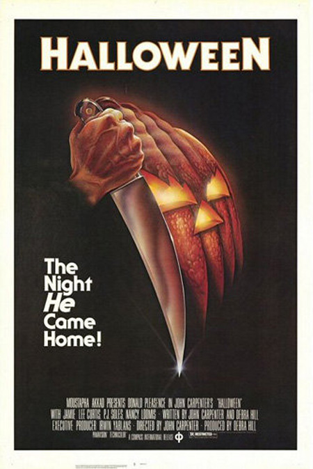
Genre: Horror
Style Notes: Hand drawn, traditional style, bold colours, reflect halloween simply, striking background that contrasts with the white text. Not very scary on its own, but it gets the point across.
Year of Release: 1978

Genre: Action/Thriller
Style Notes: Cool, harmonising colours contrast with title, trippy imagery, gives hint as to the concept and general theme, complex, and very formal.
Year of Release: 2010

Genre: Kids
Style Notes: Bright colours, bold text, contrasting colours, stylized characters, big expressions, obvious cartoony style, cute design, shows the main plot simply and effectively.
Year of Release: 2009

Genre: Kids/Action
Style Notes: Main character is clearly shown by contrasting with the rest of the background, shows the main characters clearly, the pose indicates an action driven film due to the sword and the pan, golden hair matches golden title connecting the main character with the film again, makes the princess and adapted book obvious.
Year of Release: 2007

Genre: Comedy/Christmas
Style Notes: Christmas colour hint to the story, very simple back ground, focuses on main character and how much he sticks out, dorky pose shows his personality.
Year of Release: 2003

Genre: Rom Com/Comedy/Horror
Style Notes: Bright saturated main character to draw attention to him and how much he sticks out, lots of red indicates lots of daner/blood, shows romantic element, out of place character shows the comedy, bright white contrasting writing
Year of Release: 2004

Genre: Dance
Style Notes: bright white background emphasises characters, coloured flow lines indicate movement and motion, active pose shows its an active film, less focused on romance, bold title stands out, main characters have a rebellious style to show main theme in the film,
Year of Release: 2010

Genre: Kids
Style Notes: Background indicates setting of the sea, pink main character draws focus on her, looking under a bubble shows shes curious, no other background element hints to a bigger more impacted storyline, and bright white title contrasts well and is impactful.
Year of Release: 2008
Favourite

Style Notes: I really like this poster for several reasons.
To begin with, the colours are stunning, they are bold and dark and very daunting; they indicate danger and destruction and the white title stands out so well despite its size. The detail in the drawing is magnificent to look at, the way it contrasts to the plain red background works so efficiently as a image. I also really like how the rubble forms the main iconic character demonstrating his destruction by building him out of the aftermath. The japanese kanji behind the english title also works exceptionally well as a graphic as, not only does it look stunning, but it also hints back to his origins in japan.
Finally I would also like to honour how minimal it is and doesn't scream and shot the main character, as many western films have been known to do when rebooting an old franchise.
Overall, a graphically stunning and sub text rich image that does a splendid job of being absorbing, pleasant to look at, and giving hints as to just what sort of mayhem is in store for viewers.
Year of Release: 2014
Research into films promotional Material
Sadly , most filmmaking isn't free; so when films are completed it's required to make the money back in order to make more films. The primary source of money is from the theatre when the film is released, or when the film is released in shops on dvds, blu-ray or as internet downloads. People learn about these, and the film itself, through promotional materials.


Promotional materials vary depending on the media; these go from: paper advertisements (flyers, posters, billboards, newspaper adverts, film reviews, and bus posters), film advertisements (trailers of teasers), and digital advertisements (digital poster, internet ad, pop up, trailers on video sites, film reviews).
Here's the list again in more detail on each specific type:
Paper Advertisements:
Flyers: Flyers are a rarer form of advertising for larger budget films, but for films being locally shown, its a great way to get the message out in bulk. The general format of a flyer is black and white low resolution printing on A5 coloured paper to maximise the amount they can get from a certain budget because colour ink is more expensive per sheet than coloured paper, and low resolution is quicker and cheaper than high resolution; maximising the potential profit. This also maximises viewers as flyers are normally either posted to every free public place that allows them, or thrown into crowded places for crowds to grab at.
Posters: A poster is like an evolved flyer. Measuring from A4 to A1 paper size, full colour glossy prints, and posted in shopping centres, cinemas, and bus stops. Posters do cost an incredible amount more, but the opportunity to have the full colour prints, and much more stunning definition images ensuring that every inch of the poster is fulfilling the potential to advertise the films. As they do cost more, it is rarer to see small productions using them so it is largely dominated by the bigger companis with the higher budgets.
Billboards: Exclusively reserved for the major companies, a billboard is a streetside poster that can measure from 3 meters across its longest side, to anything as big as 30 meters. Its essentially an incredibly widescreen poster; it shows the same information, and shows it all in colour and high definition. Its price does change however, depending on the size, length of display, and where its placed in relation to traffic, altering how many people it reaches.
Newspaper Adverts: These are simple, and tend to be pretty effective. Sadly, however they aren't very good value from face value; the pictures are low res, you pay a pretty big amount for a small space (or an extremely large amount for a single page), and its only show for a small amount of time (between a day or a week is average), and may or may not be full colour depending on the newspaper and their printing quality. The upsides are though that they are generally guaranteed to reach a bigger audience with popular papers, and the adverts will always be seen.

Film Reviews: A slightly more well known form of advertisement, although a very risky one, a film critic is a tried and trusted form of getting information about your film out there, as long as your film is good. Its completely free, unless you pay a critic to give you good reviews which generally detracts the film goers out of a sense of morals, and if a well known critic give you a good review it can spread like wildfire and give you incredible publicity. However, many critics aren't very forgiving, and getting an honest and good review is very difficult, but if achieved can cause wonders for films profits.
Bus Posters: A very basic, well known form of advertising, a bus poster is a T shaped poster that fits perfectly along the sides of buses. These are an extreme version of billboard because where billboards only get the traffic of a certain road, buses get the traffic of every where they travel through, spreading the range of viewers exponentially. Because of this amazing range, it is very expensive to get these posters, and they do have more variable range of times to stay up, but of course this costs more, and depending on the buses routes it can be more expensive.
Film Advertisements:
Trailers: A trailer is a short piece of film (30 secs to 5 mins) that advertises the films and give the basic set up to the story and characters. Trailers are generally easy to make, preshot footage is used and cut together with special effects, which only requires an editor and maybe one visual effects artist, or graphic artist for text, this is generally a cheap process. But the cost to show them in cinemas or on tv is the main reason why only the big films can afford this. They can cost as much a few thousand to a couple 10 thousand per showing, this all depends on when it goes on, what shows or film it fills the gaps for; either way the cost for showing trailers will weed out any small budget film almost immediately; that is unless they choose to post it online where they can either host it for free or pay providers such as youtube to play the advert before a video begins,

Teasers: Teasers are slightly different to trailers. These are generally short scenes or sequences that are released to help keep interest in the film up. Normally these are only shown on TV film critic shows, or online as a gift to fans; so this normally keeps the cost down, again you're taking pre recorded, edited film and just adding a bit of text or a title screen, but again its the cost of the showing that hurts. Unless its released online, a generally free experience but no records of money being exchanged between providers and creator have been found, however showing on TV does cost, but relatively cheaper than a trailer.
Digital Advertisements:
Digital Poster: A very new concept which has recently emerged from fan made posters online, basically its set up like a regular poster, but its animated by taking a short clip of the film and placing the text over it. Its extremely cheap to make as long as there is a graphic designer to design the text layout and it can be released anywhere with a screen which can cost, if shown in public, or be free if posted online.
Internet Ad: Always in the form of column ads or top bar ads, they are generally still images that link to a page to further advertise flim. They have gotten less popular as adblockers have become used more, but they are still one of the cheapest and most viewed ads around, the only have to pay the provider of the site to show the ad and can have it taken down whenever he wants.
Monday, 8 December 2014
Rom Com reviews
As I mentioned previously, I hadn't really looked into the genre in as much depth as I had others; In short it was simply a genre I overlooked for its general reputation for being badly written and full of unrealistic romantic idealisms, but for this project I watched 3 rom-coms I hadn't seen before to broaden my gaze and here is what I thought about them:
10 Things I Hate About You
 "10 Things I Hate About You" is a rom com written using Shakespearse 'Taming of the Shrew' as the base, but its set in a modern (late 90's/early 2000s) era. It stars a young Heath Ledger, Joseph Gordon Levitt, Julia Stiles, and Larisa Oleynik. In summary, it's about how a set of twins aren't allowed to date until the dad gives the rule that the adorable, girly twin can date when the angsty, relationship hating twin does. The movie then follows the story of a new kid who attends their highschool, falls for the girly twin and gets a dumb jock to pay a guy to go out with the angsty twin so that he can date the girl of his dreams. But then in the end the guy who's paid to date the angsty twin falls for her too and complications arise, people cry, punches are thrown, and then they get together in a happy, adorable ending.

 Personally, I ended up adoring this film. I loved Heath Ledgers character, and I felt like I related to the angsty twin, which made me giggle because I normally find those types of characters pretentious and irritating, but Julia Stiles pulls it off and makes her sincere, and incredible self contained which works perfectly against Heath Ledgers outgoing, arrogant, and refreshingly sweet character. I also like how the 3 couples stories were intertwined, it was smooth and well written and it never felt forced or clunky. Another note on writing is how perfectly cute and funny it was; the humour was actually very well crafted and fitted in each characters personality perfectly, no line felt out of place which is difficult to achieve in comedy sometimes, I'm glad it was such a good film. It also used costuming very well as throughtout the film we saw Heath ledgers character initially wearing black, and dark colours, but they graduate into paler, happier colours which reflects how the characters mood and outlook changes after they start dating. This can also be seen in Julias character as she starts off very dark colours, skinny jeans etc, and ends up in pale tops and long, pale skirts which still suits her character and doesn't seem like a wolf in sheeps clothing, to put it it simply.
Overall, a really enjoyable film, very cute and very sincere. Clever writing, very good well delivered jokes, and varied characters that hint at, but don't actually fall into clichés making them incredibly unique distinguishable. I really enjoyed this film and it's a benchmark for how to blend humour, romance, tension, and realistic emotions seamlessly. Finally, I would like to mention the morals in this film because I hate that other films lack these, it teaches people to be fair, honest, kind, opinionated, but well meaning which is normally pushed aside, and this for me makes this film one of the best.

Pretty Woman

"Pretty Woman" is actually a pretty big benchmark in the history on Romantic Comedies, it launched the careers of Julia Roberts, and the romantic comedy pairing of herself and Richard Gere. Pretty woman is another one based off a book and basically what happens is when Julia Roberts character, a prostitute, is hired by wealthy business man, Richard Geres character, to be his 'girlfriend' for a week. Over the course of this week, they fall in love, but of course people end up finding out shes a prostitute, lots of public shaming, the argue, split up, but they get back together and decide to stay together forever.
Now I must admit, this was the movie that made me lose faith in romantic comedies. Because ,although I do appreciate the fact that this film was made in the 80's so the general quality isn't as good as modern films, to me its just an overall badly made film. The writing is probably the only thing that makes it stand out, its not bad; it flows well and the characters are written in a very smooth and subtle way so we gradually get to know more about them, but its ripped out by the acting.
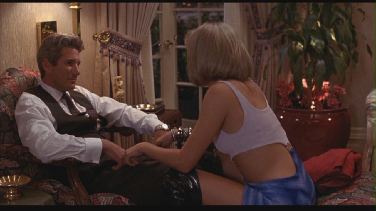 I just really don't like Richard Geres acting, he's dead in the face and makes so few emotions I struggle to bond with his character temporarily or otherwise. Julia Roberts wasn't much to shout about either but she had subtleties that at least showed her acting skills off, and on the note of acting, the sex scenes that were featured looked so awkward. Since Richard Gere can't pull any sort of emotive expression, every sex scene looked so robotic and emotionless, it just didn't make any sort of impact, that and it seemed the actors themselves just had no chemistry either; and I've seen them act together in other rom coms, they just never seem to have the spark that makes most movie couples brilliant, its really disappointing.
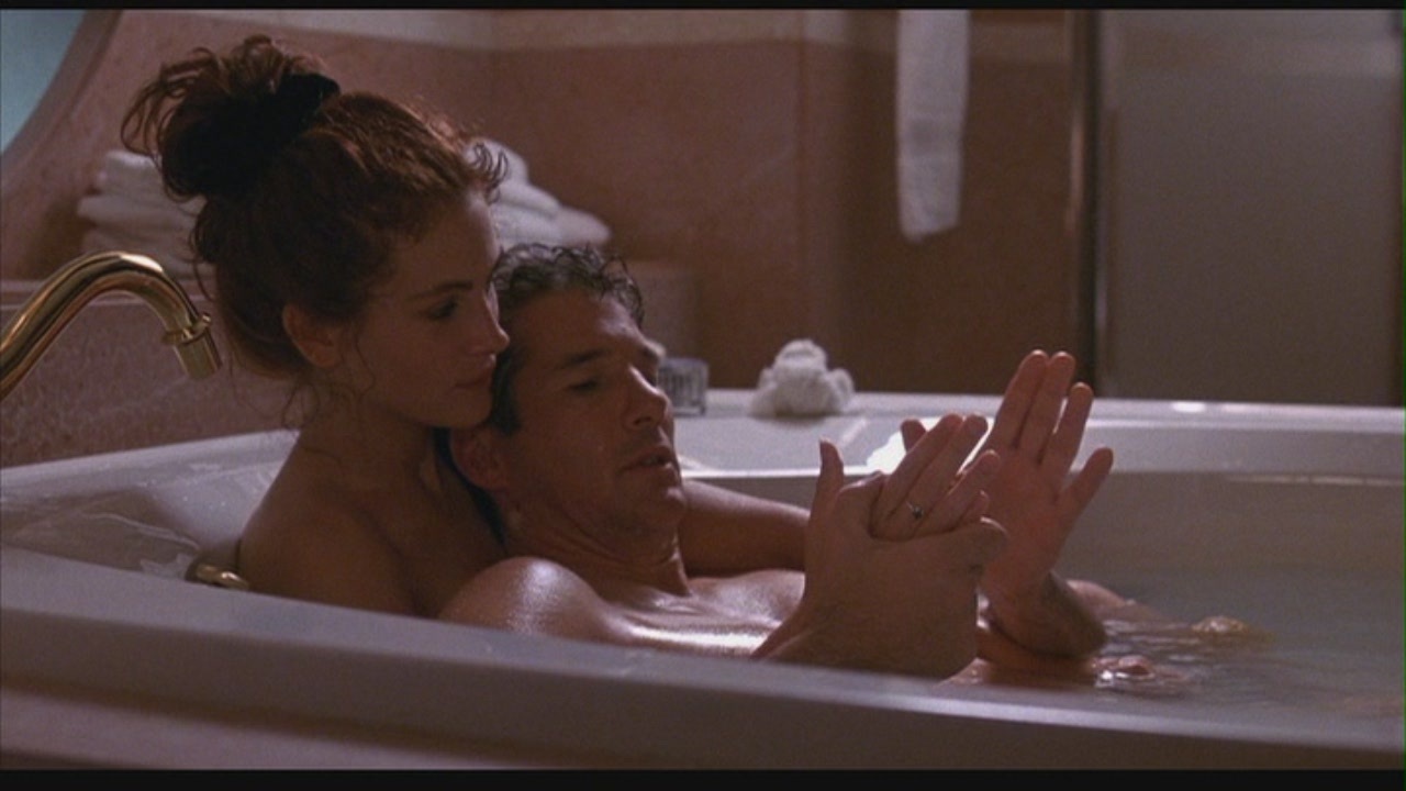 But here's another little niggle, there are easily about 4 sex scenes, and only 1 kiss; I know this is for the sake of the character ("I never kiss its too personal") but when you've seen the main couple have sex a few times, you just don't get the same payoff when they kiss. The good romance movies, in my opinion. are the ones that have it all climax at the end of the movie with an amazing, world shifting, star exploding kiss because thats the first time we see them become the couple we love, and 'Pretty Woman' just does not have that quality going for it.
Sadly, this film just does not hit the high notes for me, its just lacking in nearly every area and I can't seem to get to grips with why people like it so much. I wish I could understand the hype behind it but it was built up to be so brilliant and now it just seems like such a let down. Oh well, its not my thing and I doubt it ever will be.
17 Again

"17 Again" is a rom com starring Mathew Broderick as a 37 year old salesperson, and father, who's bitter about his current life and has been obsessing over his high school life when he threw away a basketball scholarship to support his then pregnant girlfriend, they ended up having 2 kids together but are now in the middle of a divorce after his bitterness got too much to bare. But after talking to an old janitor in the highschool and wishing to him to start his life over, he falls off a bridge and wakes up as his 17 year old self (Zac Efron). He gets to grip with being 17, starts attending his kids highschool, and starts playing basketball again believing he can do it all over again; but this motive changed when he realises how badly his kids are doing, with his son being the school punch bag, and his daughter dating the worst psycho jock there. He then has to fight helping his kids, and sorting out his divorce with his wife all as a 17 year old. In the end, he helps his daughter see the wrong in her boyfriend, help his son become a basketball team player with his dream girl, and get back together with his wife.
 What I really enjoy about this film is how seamless the transition is between the actors; Mathew Broderick and Zac Efron do an excellent job at copying and adopting each others mannerisms which really comes across in their performances. This is helped by the stellar writing in the film, its funny, light, and cute, but it hits heavy when problems and issues are raised, its realistic but incorporates a fantastic element of fantasy to make it interesting to watch. Another note on the writing is how on point the cute fluffy interactions were between couples, especially between Mathew Brodericks character and the wife, they seemed like they really did have the entire history behind their interactions but just presented with the face of a 17 year old guy, it was really fun to watch.

The characters are also stunningly written, they do tend to be a bit predictable, but still likeable and very watchable, they never seem to repeat themselves or seem 1 dimensional, its obvious to see that the director and actors worked well to create these, giving them amazing on screen chemistry and humour that makes this film.
Overall, a funny, bright, and well formed film. It delivers well on story, the interactions really are very real and sincere, the awkward interactions are the best, you feel the awkwardness with them and it makes you cringe as well, I love it. Its certainly not a legendary rom com, but its definitely an enjoyable one.

10 Things I Hate About You
Personally, I ended up adoring this film. I loved Heath Ledgers character, and I felt like I related to the angsty twin, which made me giggle because I normally find those types of characters pretentious and irritating, but Julia Stiles pulls it off and makes her sincere, and incredible self contained which works perfectly against Heath Ledgers outgoing, arrogant, and refreshingly sweet character. I also like how the 3 couples stories were intertwined, it was smooth and well written and it never felt forced or clunky. Another note on writing is how perfectly cute and funny it was; the humour was actually very well crafted and fitted in each characters personality perfectly, no line felt out of place which is difficult to achieve in comedy sometimes, I'm glad it was such a good film. It also used costuming very well as throughtout the film we saw Heath ledgers character initially wearing black, and dark colours, but they graduate into paler, happier colours which reflects how the characters mood and outlook changes after they start dating. This can also be seen in Julias character as she starts off very dark colours, skinny jeans etc, and ends up in pale tops and long, pale skirts which still suits her character and doesn't seem like a wolf in sheeps clothing, to put it it simply.Overall, a really enjoyable film, very cute and very sincere. Clever writing, very good well delivered jokes, and varied characters that hint at, but don't actually fall into clichés making them incredibly unique distinguishable. I really enjoyed this film and it's a benchmark for how to blend humour, romance, tension, and realistic emotions seamlessly. Finally, I would like to mention the morals in this film because I hate that other films lack these, it teaches people to be fair, honest, kind, opinionated, but well meaning which is normally pushed aside, and this for me makes this film one of the best.
Pretty Woman
"Pretty Woman" is actually a pretty big benchmark in the history on Romantic Comedies, it launched the careers of Julia Roberts, and the romantic comedy pairing of herself and Richard Gere. Pretty woman is another one based off a book and basically what happens is when Julia Roberts character, a prostitute, is hired by wealthy business man, Richard Geres character, to be his 'girlfriend' for a week. Over the course of this week, they fall in love, but of course people end up finding out shes a prostitute, lots of public shaming, the argue, split up, but they get back together and decide to stay together forever.
Now I must admit, this was the movie that made me lose faith in romantic comedies. Because ,although I do appreciate the fact that this film was made in the 80's so the general quality isn't as good as modern films, to me its just an overall badly made film. The writing is probably the only thing that makes it stand out, its not bad; it flows well and the characters are written in a very smooth and subtle way so we gradually get to know more about them, but its ripped out by the acting.
I just really don't like Richard Geres acting, he's dead in the face and makes so few emotions I struggle to bond with his character temporarily or otherwise. Julia Roberts wasn't much to shout about either but she had subtleties that at least showed her acting skills off, and on the note of acting, the sex scenes that were featured looked so awkward. Since Richard Gere can't pull any sort of emotive expression, every sex scene looked so robotic and emotionless, it just didn't make any sort of impact, that and it seemed the actors themselves just had no chemistry either; and I've seen them act together in other rom coms, they just never seem to have the spark that makes most movie couples brilliant, its really disappointing.But here's another little niggle, there are easily about 4 sex scenes, and only 1 kiss; I know this is for the sake of the character ("I never kiss its too personal") but when you've seen the main couple have sex a few times, you just don't get the same payoff when they kiss. The good romance movies, in my opinion. are the ones that have it all climax at the end of the movie with an amazing, world shifting, star exploding kiss because thats the first time we see them become the couple we love, and 'Pretty Woman' just does not have that quality going for it. Sadly, this film just does not hit the high notes for me, its just lacking in nearly every area and I can't seem to get to grips with why people like it so much. I wish I could understand the hype behind it but it was built up to be so brilliant and now it just seems like such a let down. Oh well, its not my thing and I doubt it ever will be.
17 Again
"17 Again" is a rom com starring Mathew Broderick as a 37 year old salesperson, and father, who's bitter about his current life and has been obsessing over his high school life when he threw away a basketball scholarship to support his then pregnant girlfriend, they ended up having 2 kids together but are now in the middle of a divorce after his bitterness got too much to bare. But after talking to an old janitor in the highschool and wishing to him to start his life over, he falls off a bridge and wakes up as his 17 year old self (Zac Efron). He gets to grip with being 17, starts attending his kids highschool, and starts playing basketball again believing he can do it all over again; but this motive changed when he realises how badly his kids are doing, with his son being the school punch bag, and his daughter dating the worst psycho jock there. He then has to fight helping his kids, and sorting out his divorce with his wife all as a 17 year old. In the end, he helps his daughter see the wrong in her boyfriend, help his son become a basketball team player with his dream girl, and get back together with his wife.
What I really enjoy about this film is how seamless the transition is between the actors; Mathew Broderick and Zac Efron do an excellent job at copying and adopting each others mannerisms which really comes across in their performances. This is helped by the stellar writing in the film, its funny, light, and cute, but it hits heavy when problems and issues are raised, its realistic but incorporates a fantastic element of fantasy to make it interesting to watch. Another note on the writing is how on point the cute fluffy interactions were between couples, especially between Mathew Brodericks character and the wife, they seemed like they really did have the entire history behind their interactions but just presented with the face of a 17 year old guy, it was really fun to watch.The characters are also stunningly written, they do tend to be a bit predictable, but still likeable and very watchable, they never seem to repeat themselves or seem 1 dimensional, its obvious to see that the director and actors worked well to create these, giving them amazing on screen chemistry and humour that makes this film.
Overall, a funny, bright, and well formed film. It delivers well on story, the interactions really are very real and sincere, the awkward interactions are the best, you feel the awkwardness with them and it makes you cringe as well, I love it. Its certainly not a legendary rom com, but its definitely an enjoyable one.
It was an interesting experience being able to look into the genre of rom coms, and I definitely have a new appreciation for it. Its also certainly enthused me at the ever looming prospect of creating my own trailer, and seeing the general base line for it helps. Overall, a fun and enlightening experience.
Research into Trailers
As the selling of the film is arguably the most important part, the creation of the trailer is equally as important as the primary selling mechanism and advertisement.
As such, through out the years trailers have gone through their various stages and eras; and here is a basic summary of the main trends:
1940s:
The 1940s introduced the use of title cards into trailers, and since then they were used almost constantly to show ever spec of detail possible. Everything from names, to titles, and release dates were loaded onto trailers and have been used ever since, although in a much more subtle manner.


1980s:
Here is where most modern trailers gained their purchase a during the 80's fast cutting became a popular trailer technique alongside the discovery, and consequent 30 year trend of using Don LaFontaine to voice over every trailer. This is where the cliché of hearing the deep 'god voice' of LaFontaine speak such catchphrases as "In a world where..." and "In a time when..." as the best way to introduce their film. This is also where the incredibly irritating trope of speaking the entire plot of the film became popular to thoroughly milk the voice of Don LaFontaine.

2010: As the reign of Don LaFontaine lasted 30 years, it took that long before another trend emerged into trailers. This trend was a particularly apparent one after the trailer of blockbuster "Inception" was released. It featured a particularly memorable noise that was dubbed online as "The BWAAAAAHHH". Basically a loud, deep droning sound, thats used to introduce tension into any sort of shot that requires it. It transitioned from thriller, drama films, to basically any film with a trailor and sound, becoming an online joke thats lasted 5 years.


The second example is from the american horror show 'Supernatural', this again uses the main clichés associated with rom com trailers to flip the genre as effectively as possible.
Overall, with these clichés in mind, I can use them to ensure the genre of my film gets across; but I also understand that this doesn't mean I should abuse them or rely entirely on them, variation is better to be remember and distinguished by, just as long as the point and purpose of my film is clear. Also, as far as history goes, I dont want my ad to be associated with a certain time period, although I was wanting it to be modern, I don't want it to follow the modern norms in trailer making, I want it to represent my style as a director and a creator.
As such, through out the years trailers have gone through their various stages and eras; and here is a basic summary of the main trends:
1940s:
The 1940s introduced the use of title cards into trailers, and since then they were used almost constantly to show ever spec of detail possible. Everything from names, to titles, and release dates were loaded onto trailers and have been used ever since, although in a much more subtle manner.
1960s:
During the 60s when Stanley Kubrik, Woody Allen, and Alfred Hitchcock were becoming the powerhouses in filmmaking, they redefined trailers as works of art. A trailer became a way to introduce the concept behind the trailer without giving away too much plot and still drumming up interest. This is was the main drive before film had the potential to become a work of art.
1980s:
Here is where most modern trailers gained their purchase a during the 80's fast cutting became a popular trailer technique alongside the discovery, and consequent 30 year trend of using Don LaFontaine to voice over every trailer. This is where the cliché of hearing the deep 'god voice' of LaFontaine speak such catchphrases as "In a world where..." and "In a time when..." as the best way to introduce their film. This is also where the incredibly irritating trope of speaking the entire plot of the film became popular to thoroughly milk the voice of Don LaFontaine.
2010: As the reign of Don LaFontaine lasted 30 years, it took that long before another trend emerged into trailers. This trend was a particularly apparent one after the trailer of blockbuster "Inception" was released. It featured a particularly memorable noise that was dubbed online as "The BWAAAAAHHH". Basically a loud, deep droning sound, thats used to introduce tension into any sort of shot that requires it. It transitioned from thriller, drama films, to basically any film with a trailor and sound, becoming an online joke thats lasted 5 years.
Also, as a final example I would like to show a cliché that has spawned within a particular company. Specifically Marvel, the comic book based film sompany. During their adds from 2007 onwards, its become token for them to begin the trailer with the villains voice delivering the exposition for the entire trailer intercut with shots of the protagonist looking tense or fighting. Its become a clear cut template they use and this, along with the inception BWAAAHH has become a popular joke among the fans online.
Romantic Comedy Trailers
As films can be distinguished by the way they are shot and edited, so can the trailers as well.
Some of the most well known aspects of a rom com trailer are fairly easy to suss out. Some aspects of a Rom Com trailer are as follows:
- Light pop/indie music: Its common practise to use happy, upbeat music, generally whatevers currently popular is first choice, or any music that lyrics can be related to the film itself. This helps for portraying the general feelings for the film and helps being our the happy, fluffy feelings to persuade the viewer to go see it.
-Introduction to the characters/couple: Although this is elementary for any type of production, rom coms have always had a specific way to introduce their main couple. It generally begins with the introduction to the main character we follow, but it almost always follows on to see them acting cute and quirky, they meet their destined partner, they act all cute and flirty, the main obstacle of the film is revealed, they break up/argue, and show potential to get back together before the end of the trailer.
Of course not every rom com trailer does this, but this is the general template thats used in cliché parodys.
-Title card framing device: Along with the short cuts, and upbeat music, another cliché is that in between certain cuts a title card is used instead of a voice over to deliver exposition. This is especially common while introducing characters. For example it's cliché for a title card to say "She was a {insert job title}" and "He was a {opposite job to female lead}" then "They never thought they would meet until one day {plot device that pushes them together}".
-Montages: As many montages as you can fit, well not as many as you can fit, but rom coms are renowned for using several montage cuts to show the passage of time; this is especially common in films that have the couple get together in the beginning, cue montage of cute couple-y things, then they break up, another montage to show how sad they are, and they get together by the end, or similar.
To show these clichés in a more practical manor, I will embed a couple of examples from youtube where fans have edited a preexisting show into a romantic comedy trailer despite their original genres. The first one is called 'A Sudden Burst of Sunlight' and is a cut together version of BBC's crime, drama show Sherlock into a cute rom com trailer. This illustrates all the main clichés listed as the best way to swap a genre in a trailor is to use the main clichés associated with them.
The second example is from the american horror show 'Supernatural', this again uses the main clichés associated with rom com trailers to flip the genre as effectively as possible.
Overall, with these clichés in mind, I can use them to ensure the genre of my film gets across; but I also understand that this doesn't mean I should abuse them or rely entirely on them, variation is better to be remember and distinguished by, just as long as the point and purpose of my film is clear. Also, as far as history goes, I dont want my ad to be associated with a certain time period, although I was wanting it to be modern, I don't want it to follow the modern norms in trailer making, I want it to represent my style as a director and a creator.
Sunday, 7 December 2014
Research into Rom-Coms
To begin my research into a relatively unexplored genre for myself, I began by looking into top romantic movie lists, finding out which ones I had seen, and which ones I hadn't; Using this, I selected a few unknown classics to watch, and explored the genre to give myself a better understanding to apply to some of the ideas I have had already to help flesh them out make them definitively rom-com-ish.
A 'rom-com' is a shortened term for the genre of films classified as Romantic-Comedies.
A rom-com is generally any sort of filmed production with a light hearted, funny storyline centred around a secondary romantic plot as well. These films generally focus around the main couples whose relationship we vouch for by the end, but its not unknown for a film to include more characters as the centre focus; i.e 'Bridget Jones Diary' includes 2 romantic interests for the protagonist, and in '10 Things I hate About You' the film actually focuses around the story of 2 (sort of 3) pairings and their romantic stories.
But regardless of the characters, there are still certain characteristics that are found frequently in rom coms; these are called 'tropes', they are defined as a common, or frequently used, themes or devices in certain genres of film, similar to a cliche but used to define the genre of a film by similarities it has to other films of the same genre.
These are one of the reasons films can have multiple genres as when using multiple tropes from different genres, it can be difficult to place it wholeheartedly into one genre. To illustrate this point better there is one trope that's older than most, but immediately recognisable as a romantic trope, the Old-Fashioned Rowboat date, which is defined by tvtropes.org as follows: "A lady and her suitor are having a romantic date on a rowboat. This was a popular dating image for the 19th and early 20th century upper classes, as it provided a chance for couples to be alone together, but still in plain sight to avoid accusations of anything sexual happening".
Other common tropes are: 'The False Soulmate' (the pre-existing relationship between one of the protagonists and another character that's, although strong, is destined to fail), The main pairing just bumping into each other at random places completely by coincidence, proof of love by grand romantic gestures, the 'just friends' pair who are good pals, but clearly seriously infatuated with each other, and most clearly, the confession itself is a massively, important trope that generally finalises each romantic film. This is just a tiny handful of tropes, the list goes on to easily over 200 tropes in the romance genre alone. The inclusion of multiples of these tropes is what classifies a romance film into this genre. It also explains why films such as Kick-Ass, Keeping Mum, and Sherlock class as romantic productions despite them being best known for being largely associated with another genre. This is in all serious as well, for example, someone cross matched BBCs Sherlock, a nearly exclusive crime drama show, with 157 romance tropes that appear in throughout the first 3 season despite its classification.
These tropes are actually very obvious when taken out of the context of a crime show; that and due to the heteronormative view most audiences take, it's normally glossed over or passed off as them being good friends. But its incredibly surprising how obvious they are, such as:
-the held gaze (where the main couple just keep staring at one another)
-love hurts (where their feelings for eachother lead to emotional, and sometimes physical pain)
-the love triangle (where an obvious 3rd-wheeling characters gets in the way of the main relationship)
-'Love will lead you back' (where no matter how far apart they end up, they are always drawn back to each other)
-'Fate will lead you back' (Where no matter how far they purposefully try to get away from each other, fate just keeps bumping them back together).
This basically illustrates how versatile tropes are and how much we depend on them
heres the list.
Another strong aspect of a rom com is the way its shot and edited. Although this obviously differs from director to director, but a general theme has formed as is pretty easy to distinguish from other genres.
For example, horror films are almost guaranteed to have the severely contrasted, dark lighting to induce fear, and tension visually which is normally heightened with the addition of sound. Whereas, in a romantic film the lighting is generally very soft, with few shadows, and very warm colours. This generally makes viewers feel relaxed and happy, a requirement for lighthearted films.
This sort of shooting helps the viewer grow attached to the characters and story; and again this is made more apparent and more effective when combined with the cute, fluffy writing, and the light soundtrack and score that comes along with it.
This is easily one of the most important dividers in genres as without the dialogue, because as long as its shot in the general warm and inviting manner, you could take away the sound the fact its a romantic film because immediately recognisable.
My favourite example of photography in romance films is easily "Moulin Rouge!". The film is about a penniless writer who falls in love with a legendary dancer and prostitute. It features modern pop songs and active dance numbers featuring around 30-50 can can dancers, and a huge production value. What's noticeable throughout the film is use of colour to reflect emotion during certain scenes. For example: When the penniless writer, Christian, first enters the moulin rouge, it contrasts with the drab streets of france by being a colourful, saturated, loud world; but with dark, sharp shadows to illustrate it being a dark, demonic place.
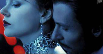 Later on in the film we see Satine (our leading lady) forced to betray her love for Christian for the money to save the Moulin Rouge, and the entire scene in filmed with blue lighting and dark shadows which I think is great way to visually illustrate how cold she feels at this crucial turning point in the film.
 The final point of interest for me is the very last shot when Satine, overcome by her long term illness, dies onstage after her final performance in the arms of Christian. What I adore about this shot is how the colours go from the saturated, joyful colour pallette, to this really dingy, pale, beige colour set. Turning from these fantastic colours to this realistic, depressing, and sobering ones instead is such a blindingly good visual metaphor for Christian realising the love of his life is dying.
Using colour in such a discreet manner to bring across emotion is one of the best tools used by modern filmmakers today, especially in the context of a romance film which rests its weight almost entirely on the emotions that come across during it.
In conclusion, seeing how films can be associated with genres more predominantly than others gave me some interesting ideas, now I know that not all rom-coms are focused solely on the the romance and, as long as its apparent to be a romance in the trailer, my film can be based around any plot line. Which is very helpful in generating ideas. Also, in the way of style, looking into the usage of lighting in the contex of subtextual storytelling is a really interesting idea I would like to work with in my own production.
A 'rom-com' is a shortened term for the genre of films classified as Romantic-Comedies.
A rom-com is generally any sort of filmed production with a light hearted, funny storyline centred around a secondary romantic plot as well. These films generally focus around the main couples whose relationship we vouch for by the end, but its not unknown for a film to include more characters as the centre focus; i.e 'Bridget Jones Diary' includes 2 romantic interests for the protagonist, and in '10 Things I hate About You' the film actually focuses around the story of 2 (sort of 3) pairings and their romantic stories.
 |
| The rowboat trope used in 'Enchanted' |
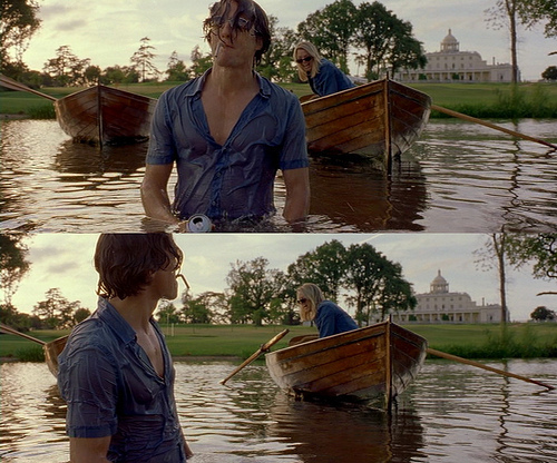 |
| The rowboat trope in 'Bridget Jones Diary' |
These are one of the reasons films can have multiple genres as when using multiple tropes from different genres, it can be difficult to place it wholeheartedly into one genre. To illustrate this point better there is one trope that's older than most, but immediately recognisable as a romantic trope, the Old-Fashioned Rowboat date, which is defined by tvtropes.org as follows: "A lady and her suitor are having a romantic date on a rowboat. This was a popular dating image for the 19th and early 20th century upper classes, as it provided a chance for couples to be alone together, but still in plain sight to avoid accusations of anything sexual happening".
Other common tropes are: 'The False Soulmate' (the pre-existing relationship between one of the protagonists and another character that's, although strong, is destined to fail), The main pairing just bumping into each other at random places completely by coincidence, proof of love by grand romantic gestures, the 'just friends' pair who are good pals, but clearly seriously infatuated with each other, and most clearly, the confession itself is a massively, important trope that generally finalises each romantic film. This is just a tiny handful of tropes, the list goes on to easily over 200 tropes in the romance genre alone. The inclusion of multiples of these tropes is what classifies a romance film into this genre. It also explains why films such as Kick-Ass, Keeping Mum, and Sherlock class as romantic productions despite them being best known for being largely associated with another genre. This is in all serious as well, for example, someone cross matched BBCs Sherlock, a nearly exclusive crime drama show, with 157 romance tropes that appear in throughout the first 3 season despite its classification.
 |
| The held gaze trope |
-the held gaze (where the main couple just keep staring at one another)
-love hurts (where their feelings for eachother lead to emotional, and sometimes physical pain)
-the love triangle (where an obvious 3rd-wheeling characters gets in the way of the main relationship)
-'Love will lead you back' (where no matter how far apart they end up, they are always drawn back to each other)
-'Fate will lead you back' (Where no matter how far they purposefully try to get away from each other, fate just keeps bumping them back together).
This basically illustrates how versatile tropes are and how much we depend on them
heres the list.
Another strong aspect of a rom com is the way its shot and edited. Although this obviously differs from director to director, but a general theme has formed as is pretty easy to distinguish from other genres.
 |
| Screen cap from horror show 'Supernatural' |
For example, horror films are almost guaranteed to have the severely contrasted, dark lighting to induce fear, and tension visually which is normally heightened with the addition of sound. Whereas, in a romantic film the lighting is generally very soft, with few shadows, and very warm colours. This generally makes viewers feel relaxed and happy, a requirement for lighthearted films.
 |
| Screen cap from Romeo and Juliet |
This is easily one of the most important dividers in genres as without the dialogue, because as long as its shot in the general warm and inviting manner, you could take away the sound the fact its a romantic film because immediately recognisable.
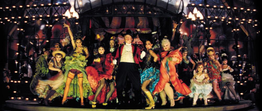 |
| The first number introducing the Moulin Rouge |
Later on in the film we see Satine (our leading lady) forced to betray her love for Christian for the money to save the Moulin Rouge, and the entire scene in filmed with blue lighting and dark shadows which I think is great way to visually illustrate how cold she feels at this crucial turning point in the film.The final point of interest for me is the very last shot when Satine, overcome by her long term illness, dies onstage after her final performance in the arms of Christian. What I adore about this shot is how the colours go from the saturated, joyful colour pallette, to this really dingy, pale, beige colour set. Turning from these fantastic colours to this realistic, depressing, and sobering ones instead is such a blindingly good visual metaphor for Christian realising the love of his life is dying.Using colour in such a discreet manner to bring across emotion is one of the best tools used by modern filmmakers today, especially in the context of a romance film which rests its weight almost entirely on the emotions that come across during it.
In conclusion, seeing how films can be associated with genres more predominantly than others gave me some interesting ideas, now I know that not all rom-coms are focused solely on the the romance and, as long as its apparent to be a romance in the trailer, my film can be based around any plot line. Which is very helpful in generating ideas. Also, in the way of style, looking into the usage of lighting in the contex of subtextual storytelling is a really interesting idea I would like to work with in my own production.
Subscribe to:
Posts (Atom)