Key notes on poster designs

Genre: Horror
Style notes: Its very minimal, and very stylized, with sterile clean colours that contrast with the title of it by being beautiful and sweet but with a medically sterile and slightly twisted feeling.
Year of release: 2014
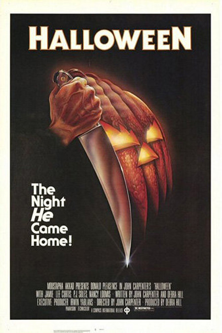
Genre: Horror
Style Notes: Hand drawn, traditional style, bold colours, reflect halloween simply, striking background that contrasts with the white text. Not very scary on its own, but it gets the point across.
Year of Release: 1978

Genre: Action/Thriller
Style Notes: Cool, harmonising colours contrast with title, trippy imagery, gives hint as to the concept and general theme, complex, and very formal.
Year of Release: 2010

Genre: Kids
Style Notes: Bright colours, bold text, contrasting colours, stylized characters, big expressions, obvious cartoony style, cute design, shows the main plot simply and effectively.
Year of Release: 2009

Genre: Kids/Action
Style Notes: Main character is clearly shown by contrasting with the rest of the background, shows the main characters clearly, the pose indicates an action driven film due to the sword and the pan, golden hair matches golden title connecting the main character with the film again, makes the princess and adapted book obvious.
Year of Release: 2007

Genre: Comedy/Christmas
Style Notes: Christmas colour hint to the story, very simple back ground, focuses on main character and how much he sticks out, dorky pose shows his personality.
Year of Release: 2003

Genre: Rom Com/Comedy/Horror
Style Notes: Bright saturated main character to draw attention to him and how much he sticks out, lots of red indicates lots of daner/blood, shows romantic element, out of place character shows the comedy, bright white contrasting writing
Year of Release: 2004

Genre: Dance
Style Notes: bright white background emphasises characters, coloured flow lines indicate movement and motion, active pose shows its an active film, less focused on romance, bold title stands out, main characters have a rebellious style to show main theme in the film,
Year of Release: 2010

Genre: Kids
Style Notes: Background indicates setting of the sea, pink main character draws focus on her, looking under a bubble shows shes curious, no other background element hints to a bigger more impacted storyline, and bright white title contrasts well and is impactful.
Year of Release: 2008
Favourite

Style Notes: I really like this poster for several reasons.
To begin with, the colours are stunning, they are bold and dark and very daunting; they indicate danger and destruction and the white title stands out so well despite its size. The detail in the drawing is magnificent to look at, the way it contrasts to the plain red background works so efficiently as a image. I also really like how the rubble forms the main iconic character demonstrating his destruction by building him out of the aftermath. The japanese kanji behind the english title also works exceptionally well as a graphic as, not only does it look stunning, but it also hints back to his origins in japan.
Finally I would also like to honour how minimal it is and doesn't scream and shot the main character, as many western films have been known to do when rebooting an old franchise.
Overall, a graphically stunning and sub text rich image that does a splendid job of being absorbing, pleasant to look at, and giving hints as to just what sort of mayhem is in store for viewers.
Year of Release: 2014
No comments:
Post a Comment